Hey, guys,
Glad to be writing to you again! We’ve got a little older together though a lot more confident!
I have to admit - we’ve failed the goal of this sprint... The cloud service hasn't been created yet... But! This had its good reasons, or rather one very big reason - our brave users who help us to improve the app day by day, bug by bug, feature by feature!
Guys, thank you so much for such a powerful contribution! For literally a couple of weeks we’ve made a huge leap in the development of the project.
Thank you for comments and criticism, they make us stronger!
Thank you for all the ideas, we are creating a unique product based on them!
Thank you for your support, thanks to it we are standing firmly on our feet and feel that we are moving in the right direction!
Even though the goal of these two weeks has not been met, it still came out outstanding. So today I'll tell you about one improvement which I've had in my head for a long time, and then just show you the epic list of other improvements for version 0.2.3.
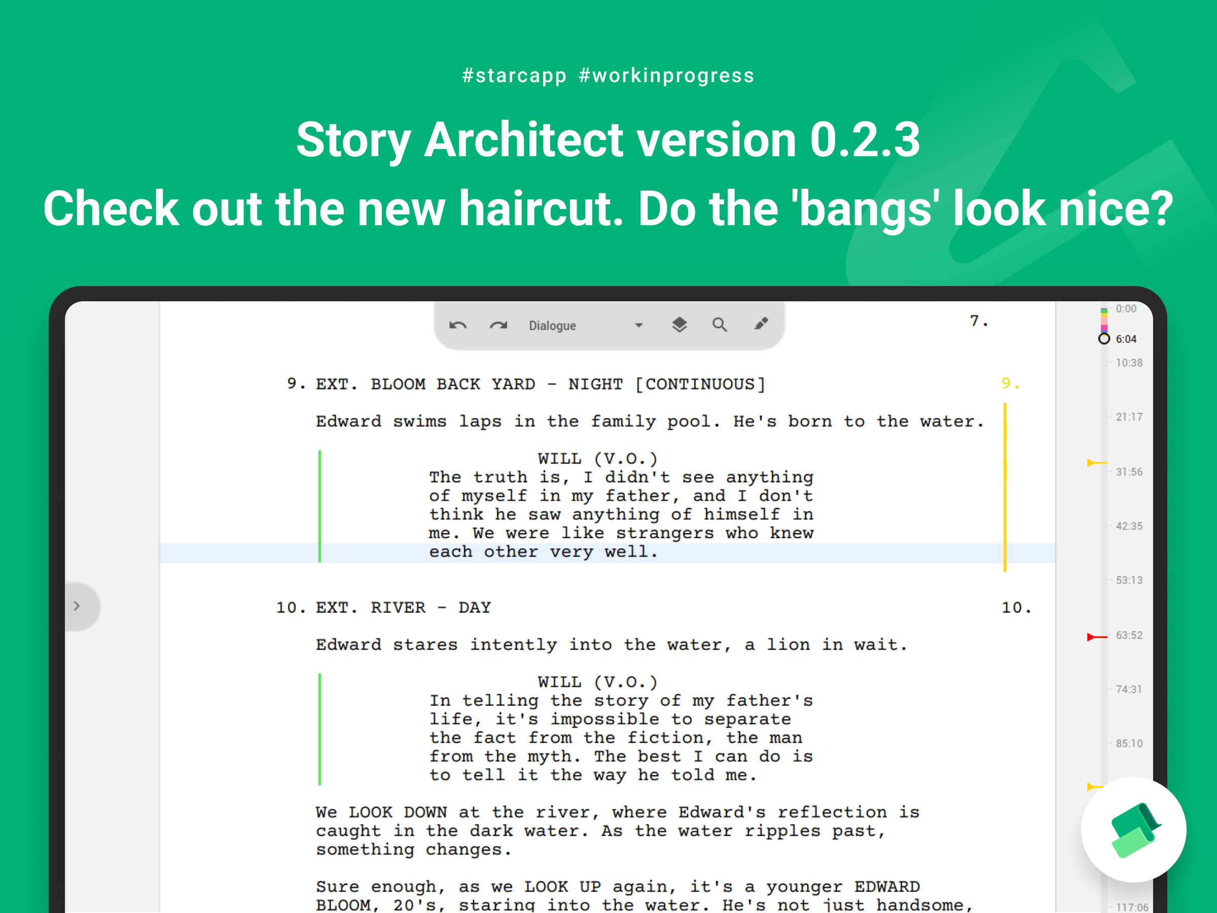
Ahem... ahem... what? ‘Bangs’?
From the very beginning, one of the most controversial visual decisions in the Story Architect interface was the way the toolbar is displayed.
When creating some of the first sketches of what our app would look like, I spent a lot of time studying the interfaces of both existing apps and non-existent concepts. And there was one thing that really confused me: the toolbar had the full width of the workspace, no matter how many tools were in it. So just two buttons could eat up a whole bunch of usable space on the screen, because they were dragging a lifeless bar.
At some point I had an idea to use the floating action button concept from Google's Material Design for the toolbar. It's a button that is usually placed in the corner right on top of the content, which has two good points:
1. the button is always at hand - the user knows for sure where its placed;
2. it takes a minimum amount of space, clearing an entire screen in order to place an important content that the user works with.
But as you know it's easier said than done. I drew the concept on paper and it looked not only ergonomic and economical, but also very nice. But when it came to practice, everything wasn’t so smooth…
Many users complained that it was inconvenient and said it overcovered everything on the screen and even suggested that we throw it the hell away :)
But we decided to take our time and try to reflect on what was going on.
On the one hand, it was clear that many people are simply confused by the unfamiliar visual solution. They had not yet worked with interfaces of this kind - unknown stuff often gives us a hard time.
On the other hand, we faced very specific cases where this solution revealed its flaws. This was especially evident in the text editors on small screens. The panel just blocked a part of the text, thus defeating the very purpose for which it was created; instead of giving more content to the screen, it was tearing it into two parts, in addition, making them impossible to connect. And besides, the panel looked kinda taller than the text itself which made it too eye-catching, and when you quickly look at the interface it took on as much attention as the content.
A temporary solution to these problems was a translucent panel effect. It allowed me to close the problem, but in the background I was looking for a solution to this problem for a long time...
And I think I’ve found it. And it turned out to be super trivial :) You just had to take the classic panel, cut off the excess buttons and place it in the center! Eureka! This solution combines all the advantages of both approaches, and at the same time is quite understandable and does not cause rejection among users.
What's also interesting here is the path I had to take.
I think I’ve tried all the panel layouts - corner, center, edge, indented, vertical, and horizontal - but it just wasn't right. The reason for my dissatisfaction with any of these solutions is hard to identify. Perhaps, it was because I was using the wrong visual image of the panel I had already created, which I tried to rearrange.
And then the other day, discussing the panel, one of the users said the magic phrase: “Like the ‘bangs’ on an iPhone”... Haha! That’s precisely it!
We’ve quickly made layouts to see how fantastic it looks. That same day, right in the subway, on my way to the basketball game I adapted the existing panel to the new reality, and what did I see? The panel got lost among the text... It was almost impossible to see, as it merged with the text of the page...
All sorts of emotions and thoughts rushed through my head at this point and I decided that I would run around, hang out with the guys, switch gears, get emotionally unloaded and then on the way back I would make another attempt and try to find a way to save this ship of hope, which had already begun to sink in my head.
Oh gods! Thank you for giving us sports! The switch worked for me and after a few experiments with colors, contrast and transparency, I managed to find a great solution that worked regardless of the app's theme color settings!
I hope you like the new toolbar. Personally, I love it… because we've been through so much together!
Reviewing
Also, we did a lot of work to improve the review mode in this update. Almost all of the mechanics have been significantly improved.
When adding a new comment or editing an already created one, the app places the comment input field so that the context of the place you were working with is preserved as much as possible.
When entering a comment, you can now add new lines in the usual way, and save the entered comment with the Ctrl+Enter key combination (Command+Enter in macOS).
When editing/discussing editorial notes, Starc will anticipate your wishes and will activate the desired state.
And finally, we added an ability to change or delete your reply in discussions to editor notes.
Other improvements
- Personal profile now allows you to manage subscriptions to the STARC news;
- A button to hide the navigator panel has been added (it appears automatically if you move the cursor over the navigator and disappears when you move it away);
- Added the feature to create script acts (a separate format for acts has been added)
- Added the feature to disable the automatic correction of the script text on the page breaks;
- Added the option to automatically replace the three dots with the ellipsis;
- The app now remembers the duration of the last writing sprint, so that you won’t have to set it up again the next time you run it;
- The path and name of the exported file for documents is now saved, so the previous used name will be suggested automatically next time;
- Added a tooltip for the custom theme setup panel of the app;
- When editing a version, you can now check or uncheck the box that controls the possibility to edit the version text;
- Improved use of the context menu for cases when the user wants to use the spell checker;
- Improved some texts in the app settings;
- Improved behavior of the Add New Document dialog. The text document will now be selected by default, so you no longer have to delete an accidentally created folder. Besides, the documents created in a folder will now be marked for insertion into it;
- Context menu of the project navigator has been improved;
- Improved logic of inserting the copied text in different cases;
- The cursor positioning when pasting text from the clipboard has been improved;
- Rendering quality of the writer's sprint panel was improved;
- Improved location rules for scene titles;
- Improved display of the app theme preview in settings;
- Fixed a crash when changing the script and audio plays text after CTRL+V;
- Fixed an issue with the cancellation of automatic script text corrections when turning off the corresponding option;
- Fixed an issue with importing multi-line editorial notes and formatted text from KIT Scenarist projects;
- Fixed a crash when canceling the last action, when no headings are left in the text of the document;
- Fixed an issue with assigning a photo and other parameters of an edited character to another character;
- Fixed an issue with losing the first character of text inserted into an empty paragraph;
- Fixed an issue with shuffling text blocks when pasting from the clipboard;
- Fixed an issue with the size of the cover page editor toolbar when its first opened;
- Fixed an issue with loading the ‘read-only parameter’ for versions of text documents;
- An issue with displaying the color of the edited version was fixed;
- Fixed an issue with incorrect checkmarking of scene number display in the app settings;
- An issue with loading interface translations for options menu in navigator was fixed;
- An issue with displaying scene numbers after canceling the last action that changes the title text was fixed;
- Fixed an issue with being able to export or not export editor notes;
- An issue with exporting user defined scenes was fixed;
- Fixed a crash when automatically correcting script text on page breaks in some cases;
- Fixed an issue with deleting a second editorial note while editing the first note in the same paragraph;
- Fixed a crash in Windows when adjusting the color of a custom theme.
Wow, you guys are great! Once again, a huge thank you from the whole team!
Now we will surely work on the cloud :)